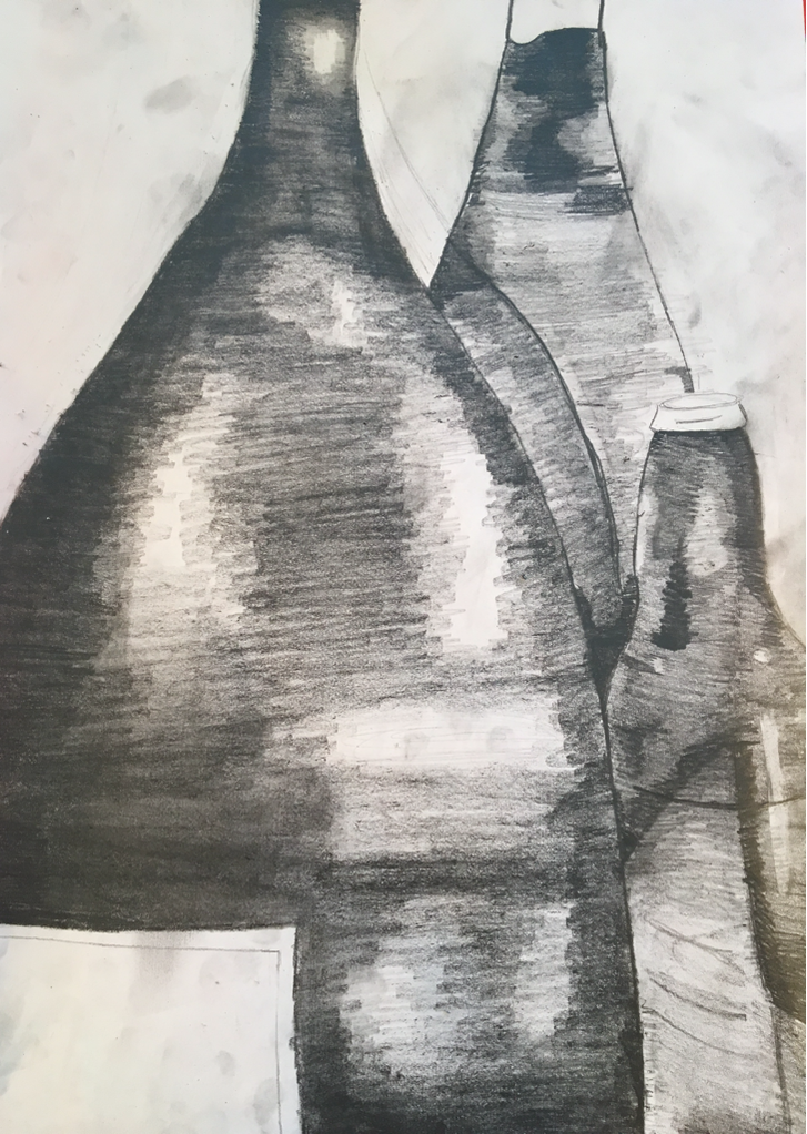
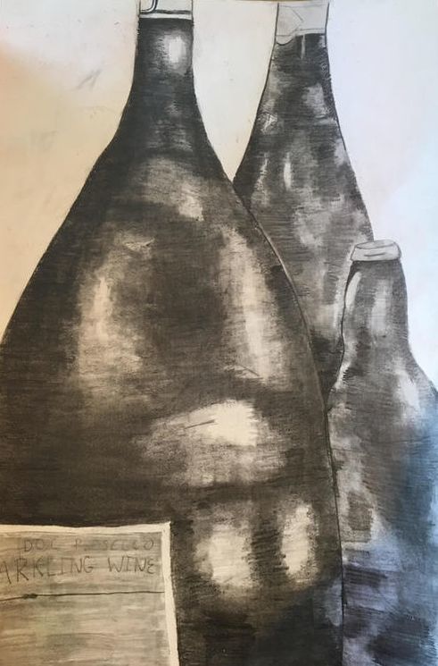
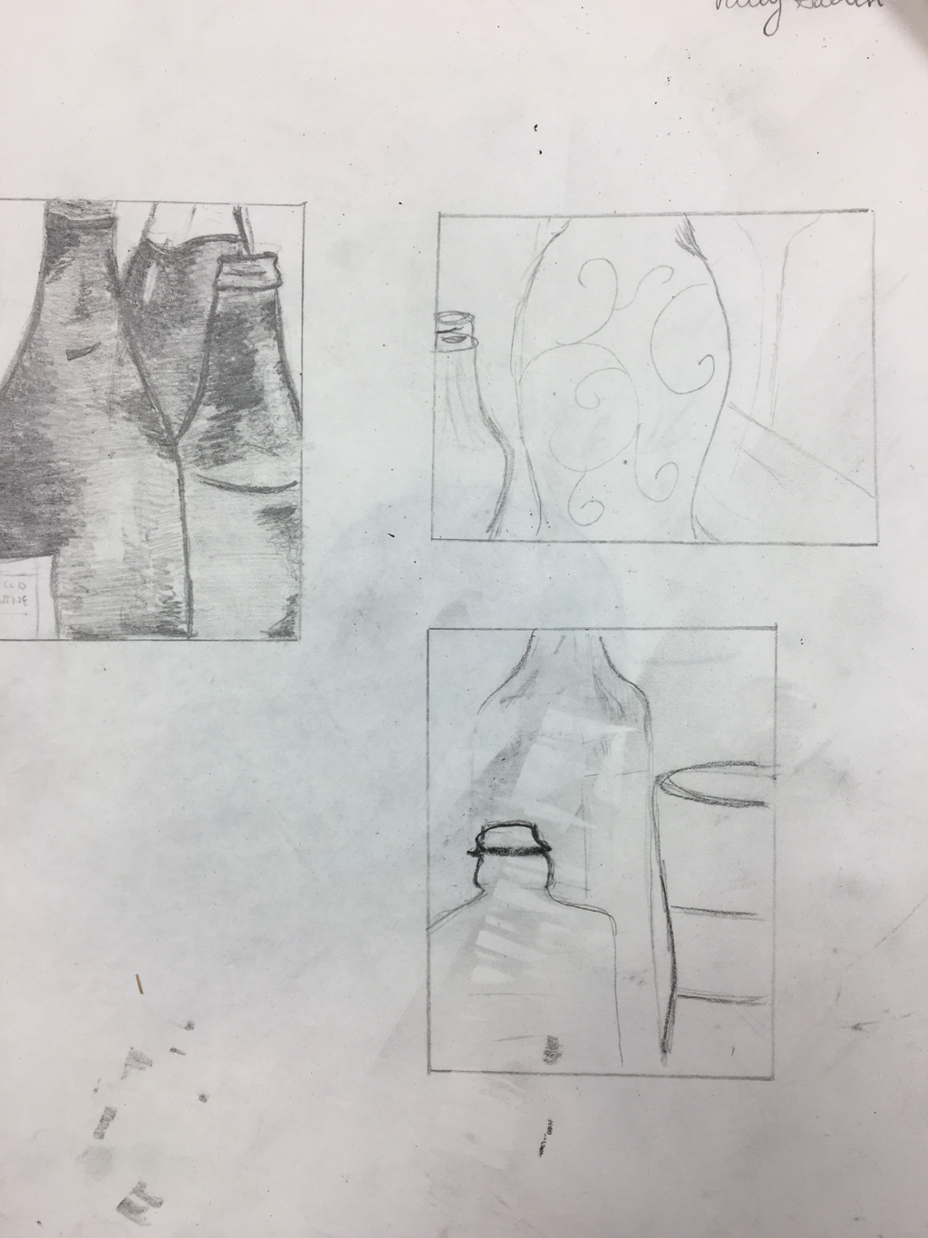
Still life Pencil Drawing:
- Describe how you arranged your composition. Discuss your use of the elements and principles. Is it a successful composition? I described my piece by having the bottles take most of the space up and being the main focus. I used a variation of line, value and space to make this piece look life like. I think it is pretty good but if i could redo it i would add more background.
- Did you use a wide range of values? (A range from white to black with at least 9 values). Explain how is this evident?
- Explain how your knowledge and creating practice studies with value contributed to your piece. We practiced value in art 1, so I had prior knowledge. It helped me be able to show the darks and lights of the piece.
- Describe the blending and transitions in your objects (discuss your use of pressure with pencil and other techniques to achieve this). I used a blending tool over the whole thing because i couldn't figure out how to blend with it. I was able to show emphasis of each piece by adding darker, smoother values to transition the bottles.
- Explain how your interpretation of texture is essential in capturing the look of the object.
- If you could recreate your pieces what would you do differently to enhance the final outcome?
|
|
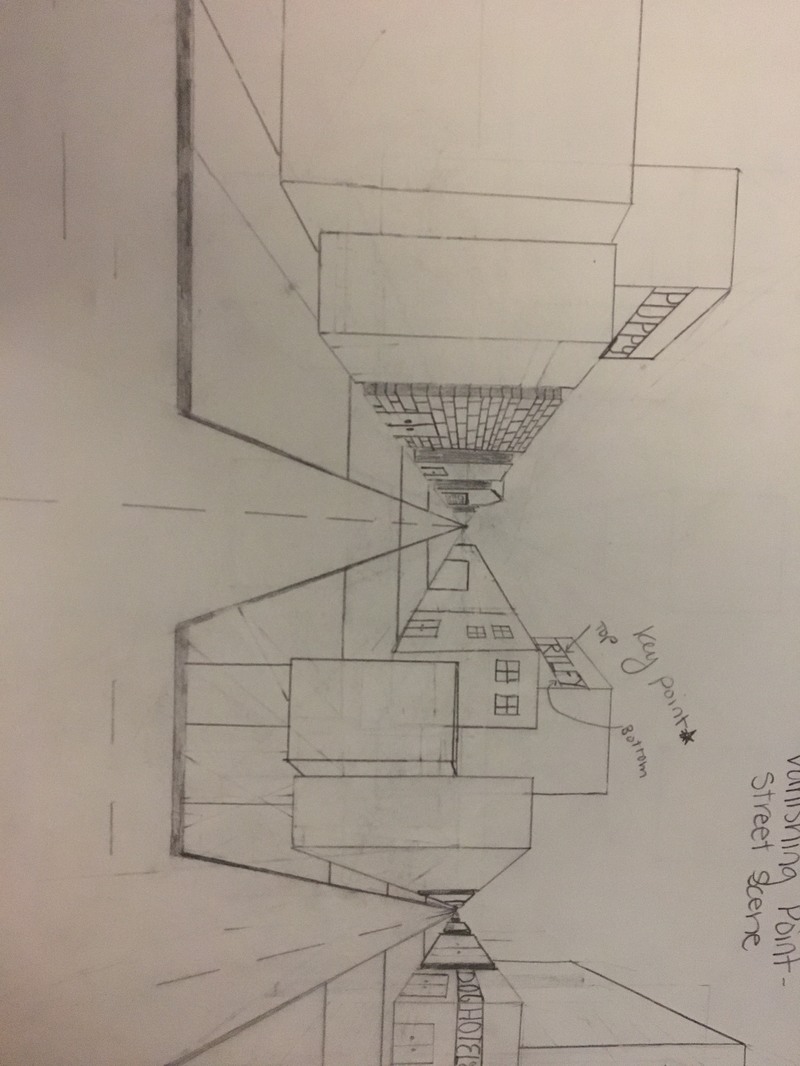
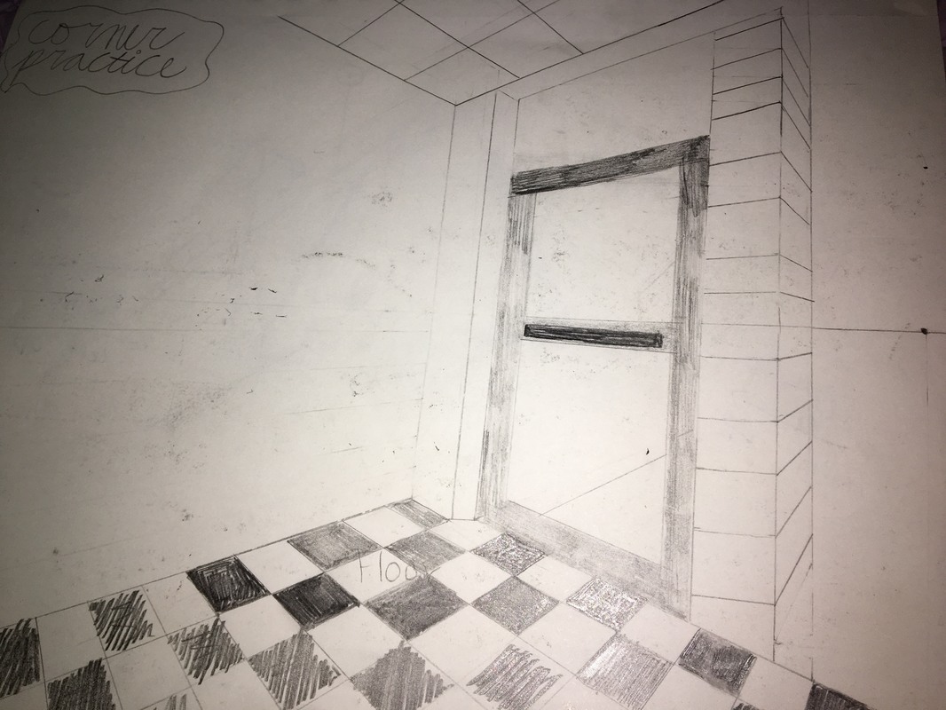
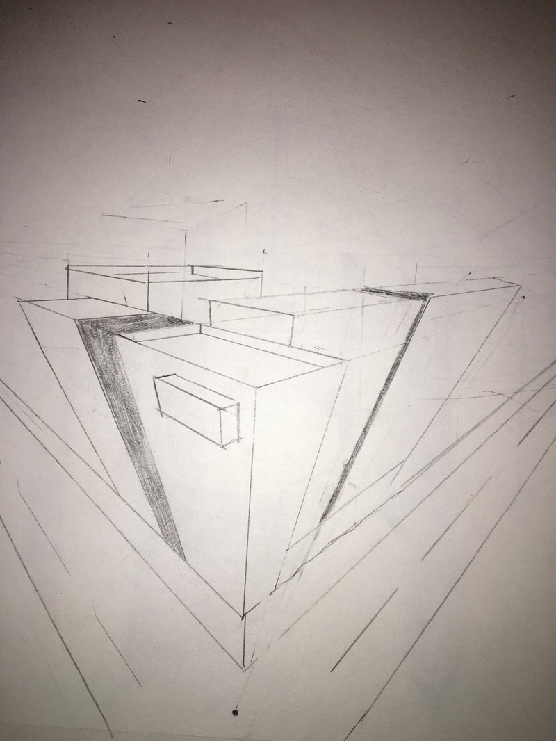
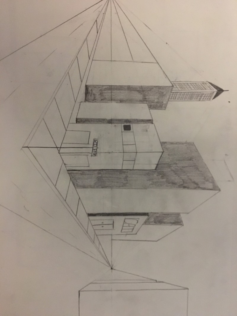
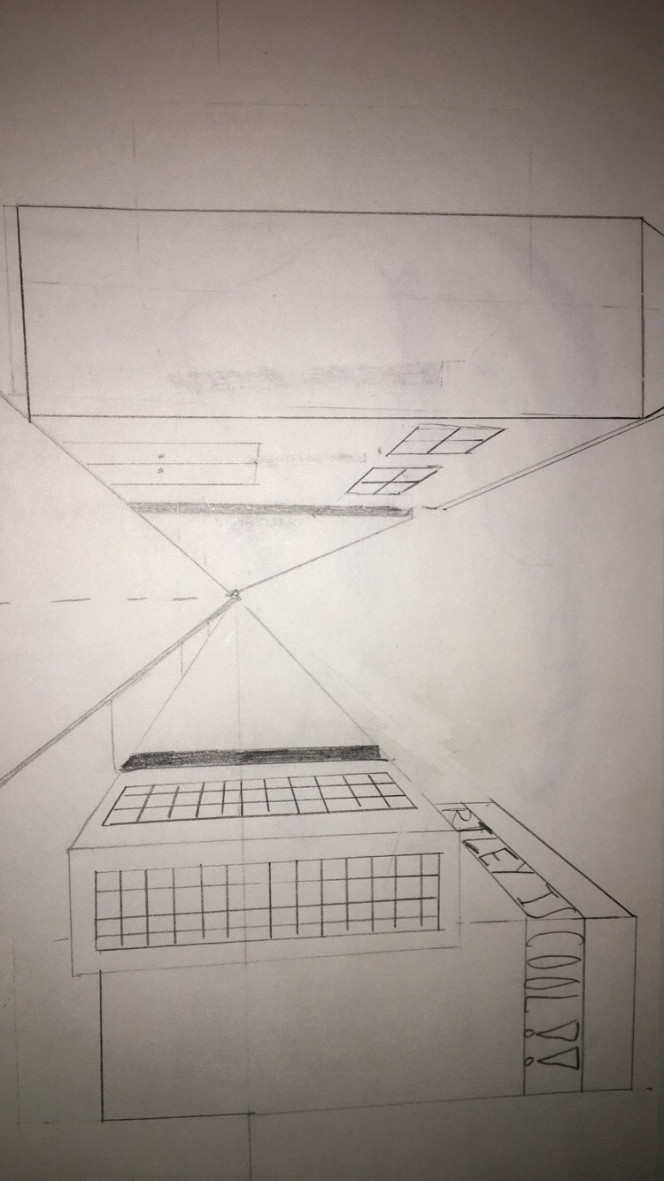
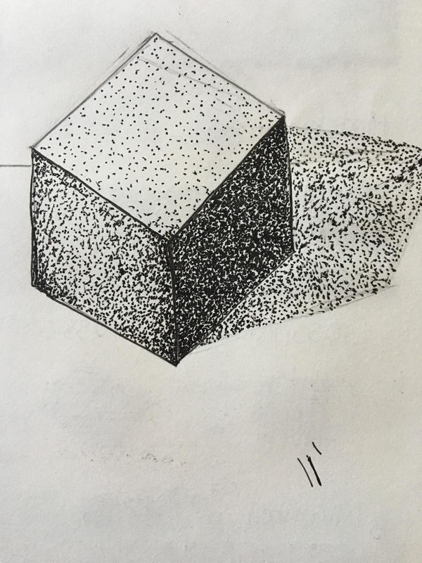
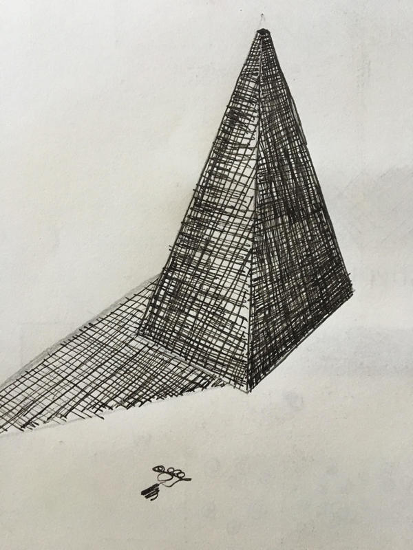
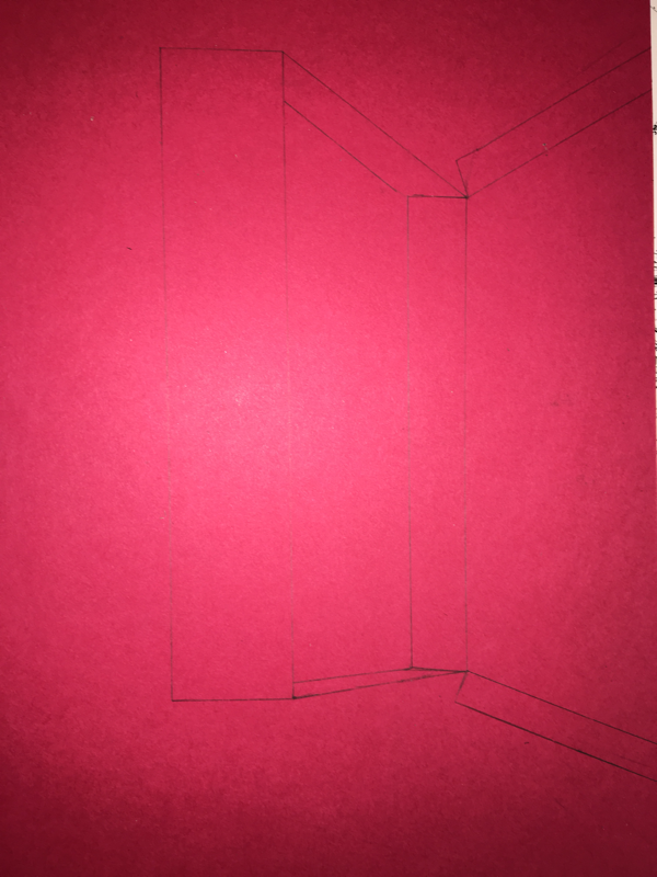
Point Perspective Pen Drawings
For the point perspective pen drawings we drew first, second, third and a corner of a room drawing. I had a hard time on third point which made my piece look bad because i didnt know what i was doing.
|
|
|
|
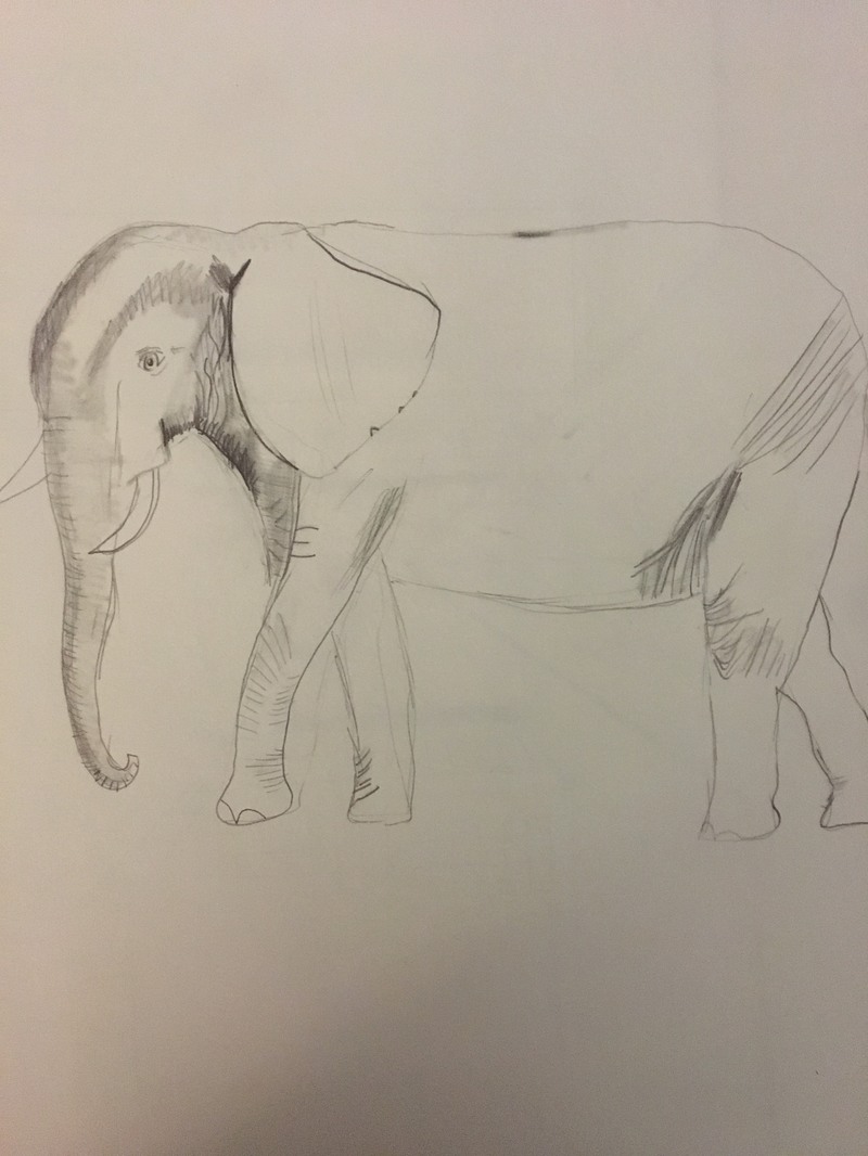
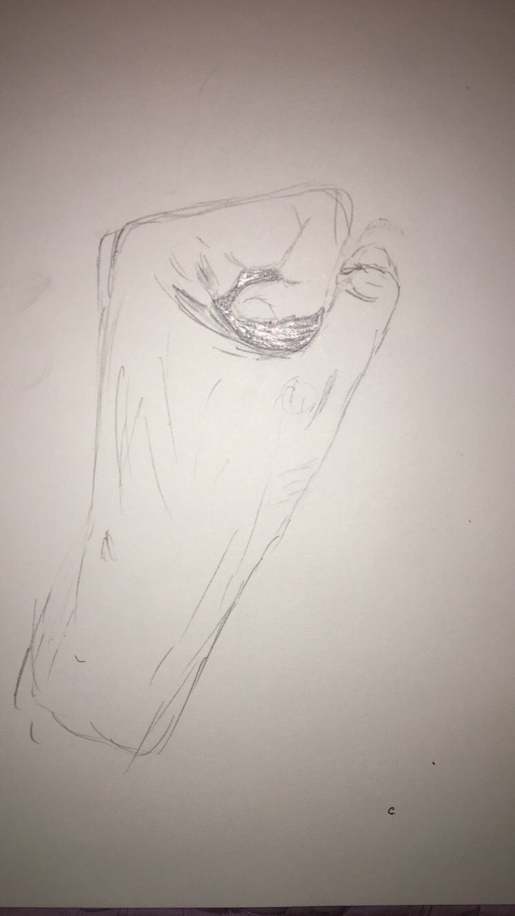
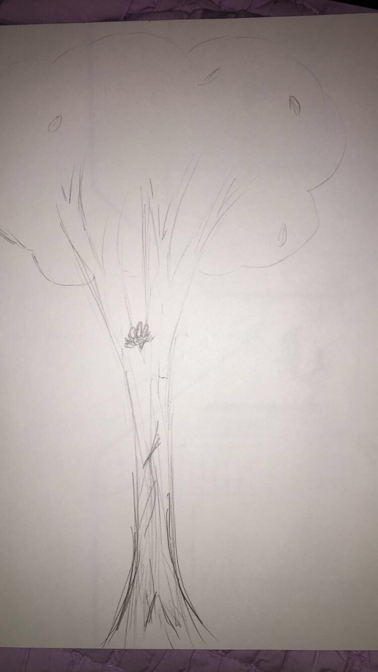
First four drawings
For our first assessment we were supposed to draw an animal, a street scene, a hand, and a tree.
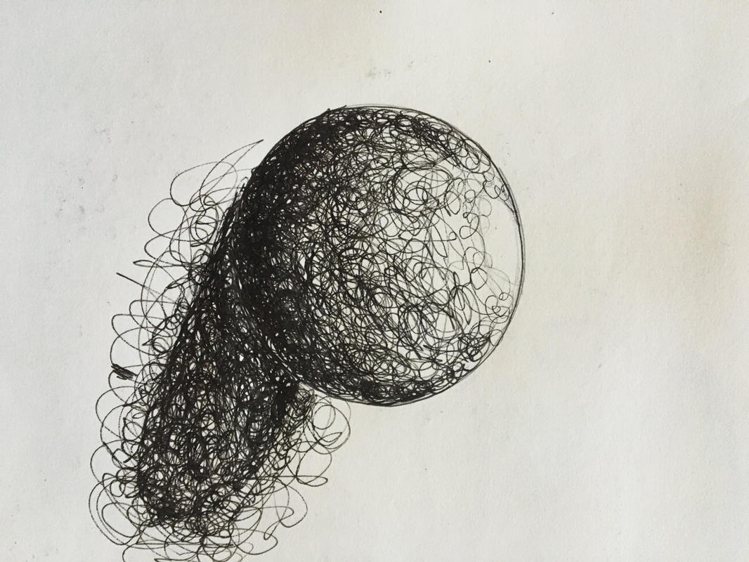
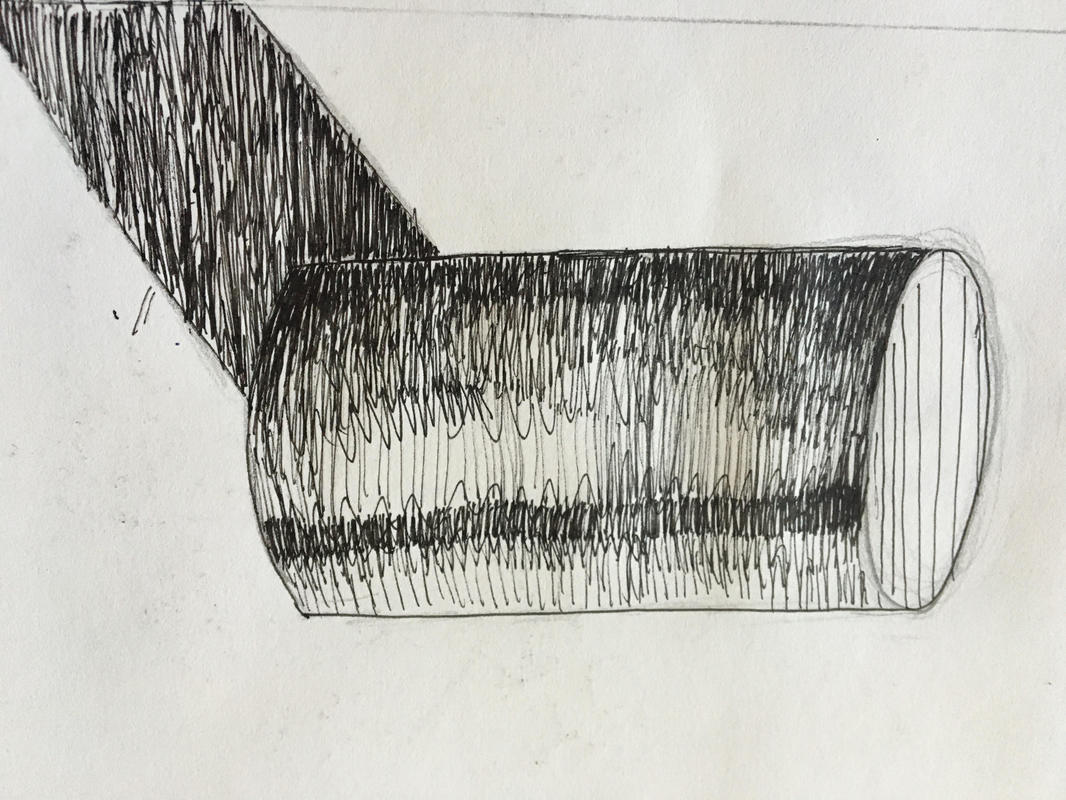
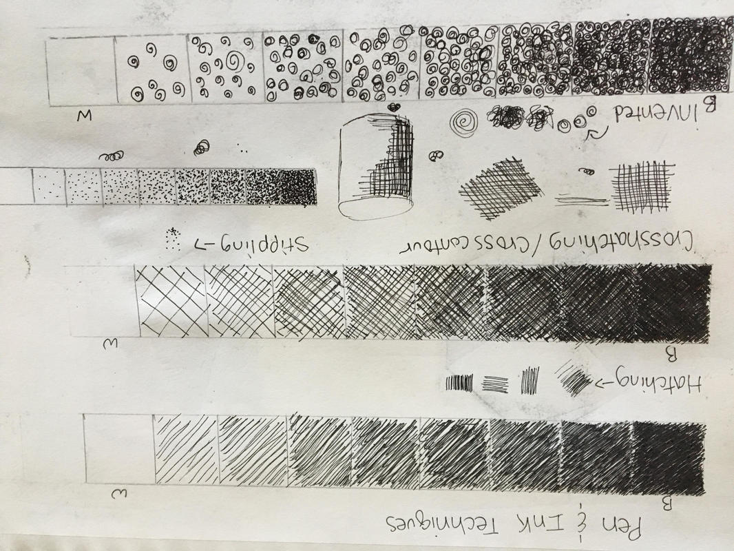
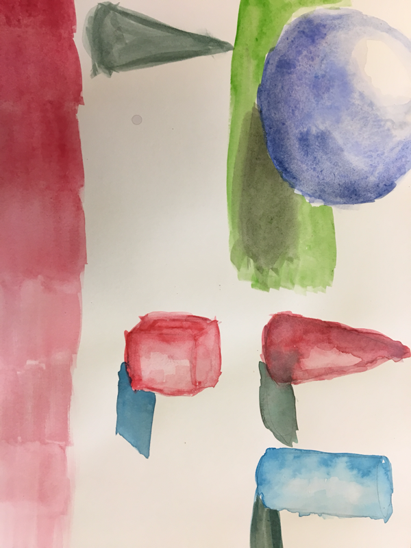
Pen Techniques and figure practice
We learned how to draw with pen using different techniques like stippling, hatching, cross hatching and invented. After learning those techniques we drew a sphere, cone, rectangular prism and cylinder.
Pen Perspective Drawing
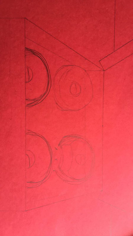
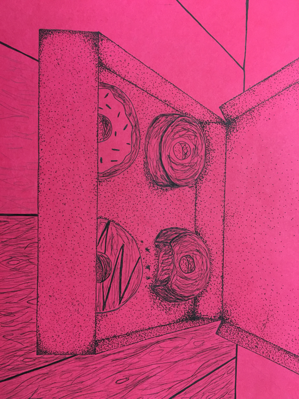
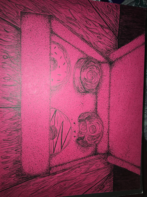
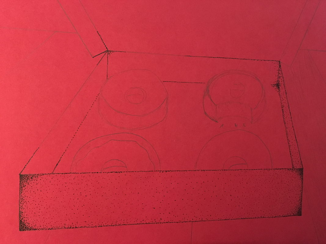
For this project I chose to use stippling, hatching, and invented. I decided to use stippling because I figured it would give me the depth i wanted for the box. I then used invented to make the floor wooden; this was very difficult. For the perspective part of my piece, i made the box the main focus. It took me many tries to get it to look right. Perspective is important because it shows how you view something. Texture was an extremely important part of your piece to make my donuts look real. I think i used too much texture by adding the wooden floor. Value is important in this project because sense its perspective its necessary to be able to exactness of the location and part of the piece. I think my piece was nicely done, but i could have been neater with my stippling and my wood. It is important to make sure you understand the concepts of pen and ink techniques taught in class because it shows in how well your piece turns out. From this project i learned a lot about perspective and I will take my knowledge of all the different points and use them in my future pieces. also rulers are helpful for this piece.
Watercolor Apples
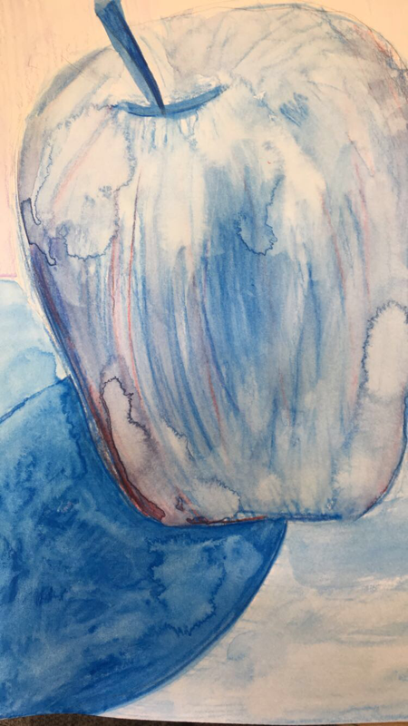
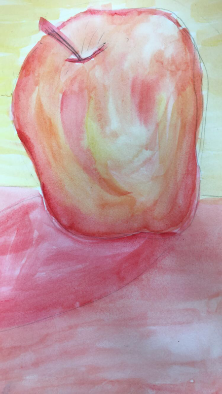
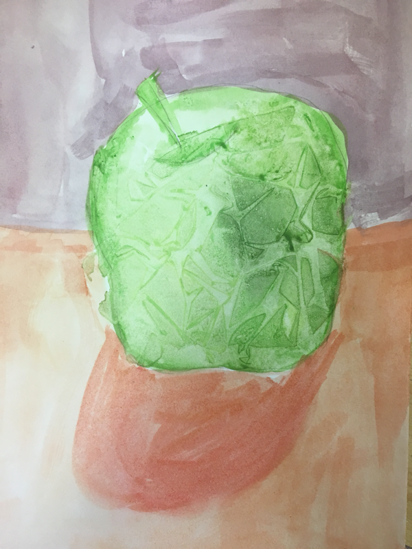
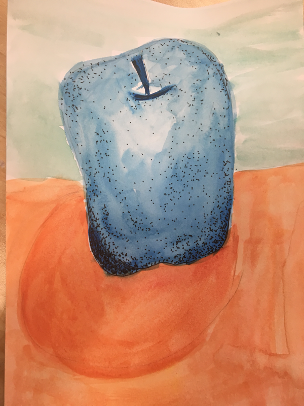
The first apple is monochromatic used with pencils, the second apple is warm, the third apple is plastic wrap, and the last apple is complimentary colors with pen added.
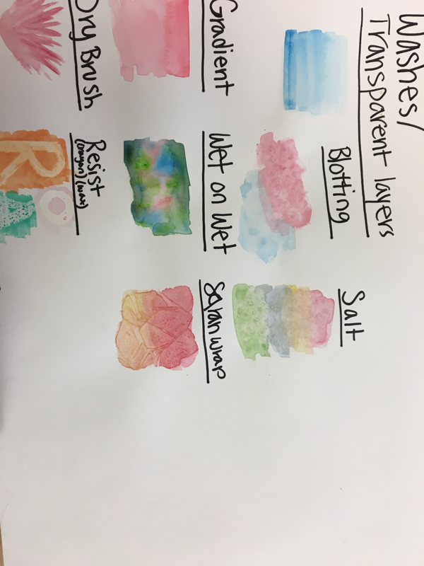
Watercolor
color scale chart and different techniques. The techniques we used were blotting, salt, resist, Saran Wrap, wet on wet, dry brush, gardient and transparent layers.
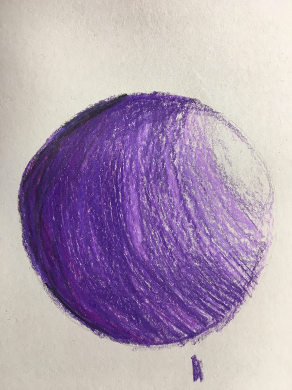
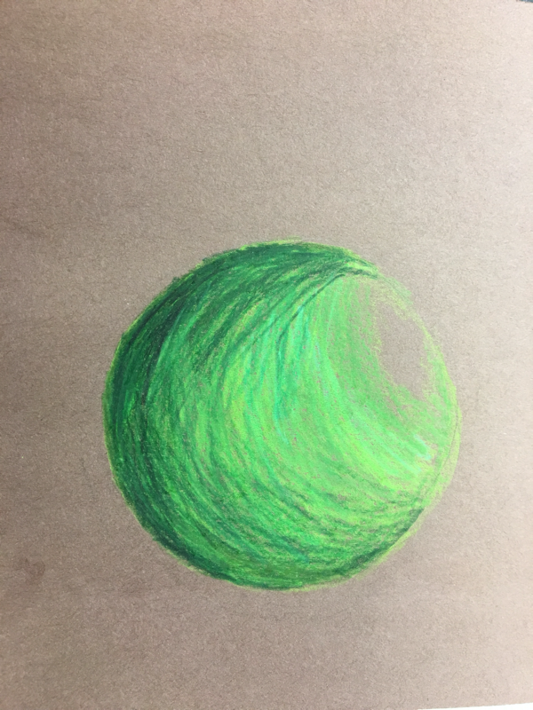
Prisma color pencils
we learned how to use to prisma by drawing spheres.
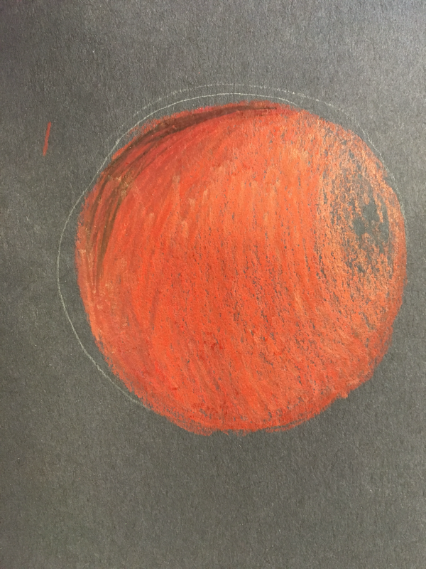
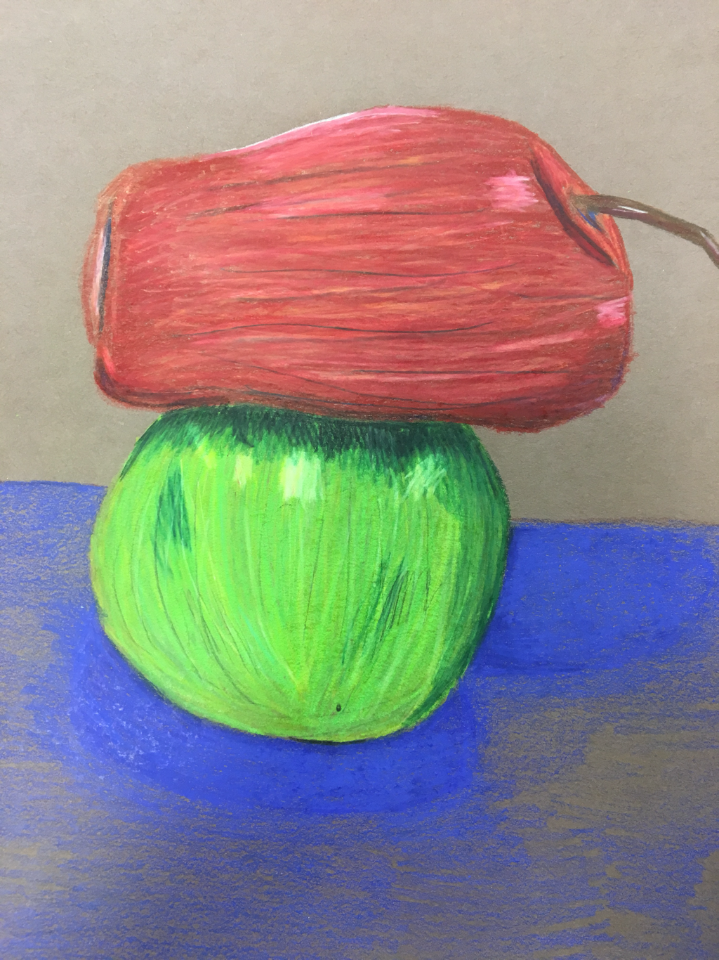
Pastel
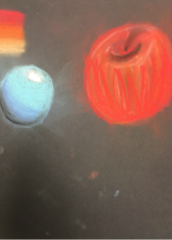
prisma-- fruit still life
I used prisma color pencils to draw fruits. It's not finished but i practiced how to blend colors
Georgia O'Keeffe: Inprogress
Georgia O'Keeffe: Final
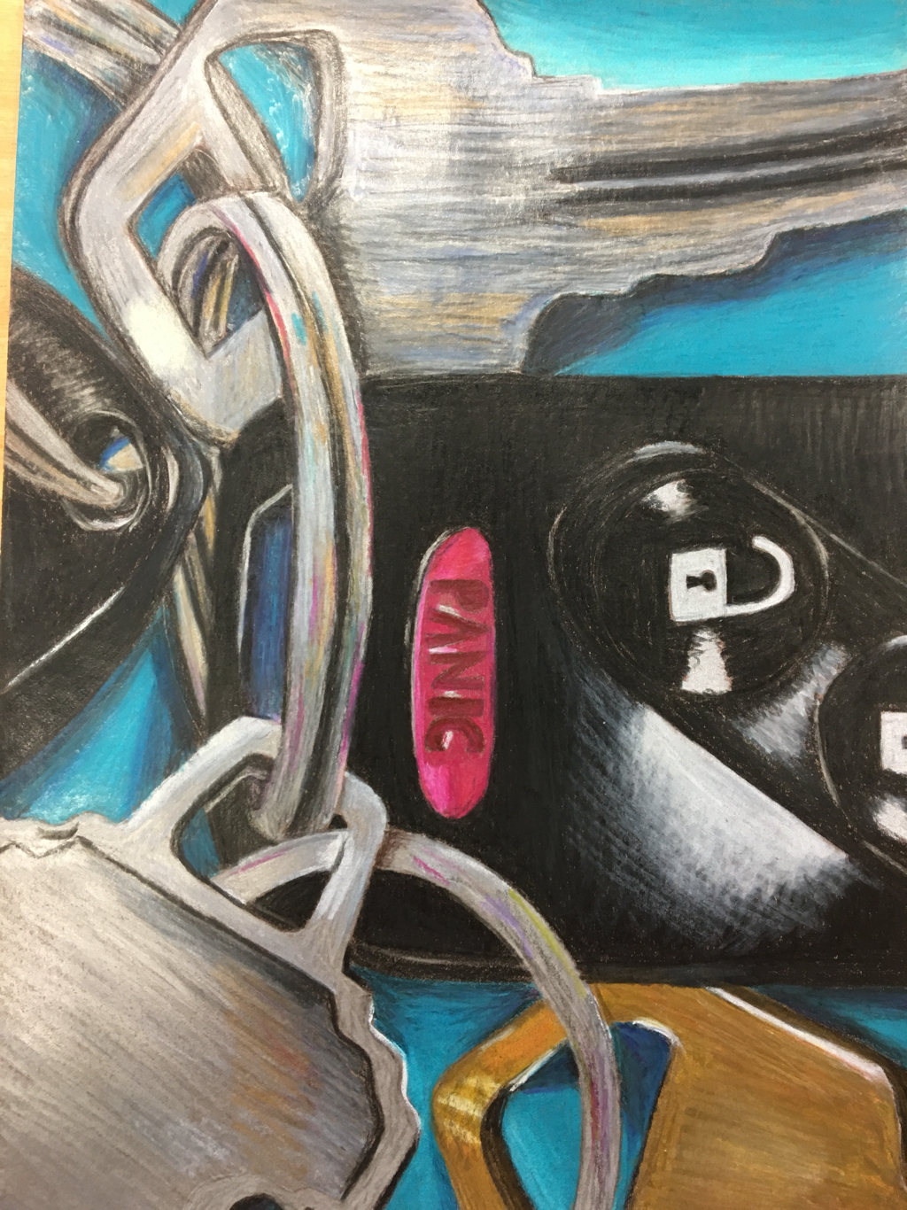
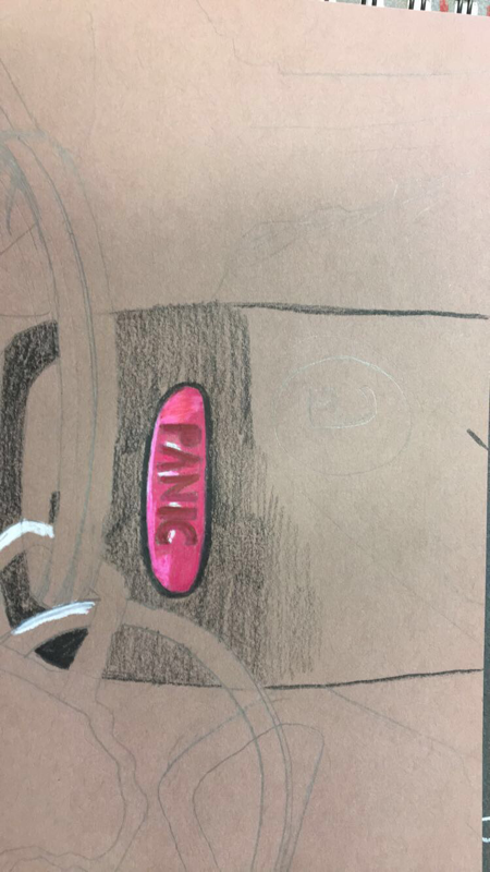
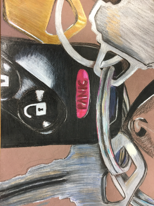
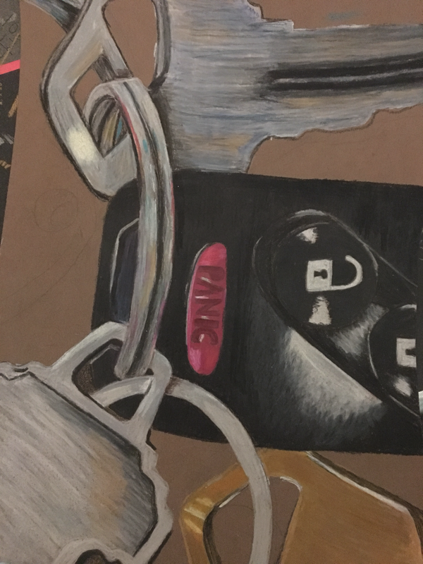
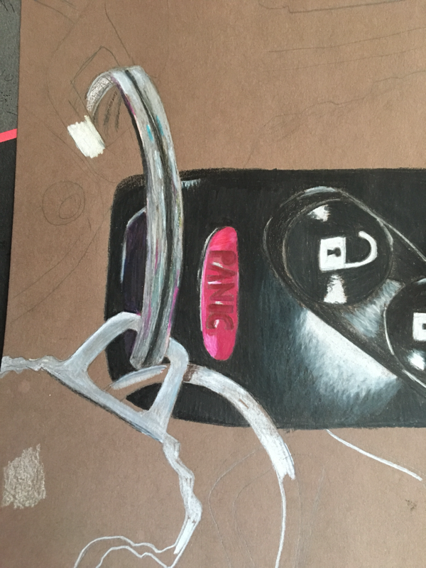
For my piece, I chose to do my car keys. My piece is well made and is pretty neat. I could have done a better rough sketch because as I was doing I had to extended parts of it which made it hard. To show the real-ness of my piece I had to use a lot value. Some places need more but value was a big part of my piece. My piece doesn't necessarily reflect on how the inspired artist made her pieces. I guess that I zoomed in on it. For my colors, I used to brown paper. Most of my keys were black and silver so it was hard to add value and to make it look good. But I just accentuated the colors and made them brighter. For the keys I changed the colors so that they were all different and to make them pop I used turquoise, which was in the reflection of the keys. I had contract in my piece by adding the bright colors and using highlights. By using highlights, shadows and textures I made my piece look more realistic. I didn't use texture as much but highlight was a main part to show the reflection of the silver. The difficulties I had during this piece was how I initially drew the sketch of it wasn't as three dimensional as I would I liked so I had to go back and add which was hard. Also I didn't like the colors I used but I wasn't able to go back over it because it was too waxy. So next time I do a piece with prisma color pencils I need to plan more before I start.
Inspired artist project
https://docs.google.com/presentation/d/1qVB7eaMzYjtVbbnIbDaGsE1dJCBT1K7z80U4lrB2Mlc/edit#slide=id.g1de4d5dac5_0_9
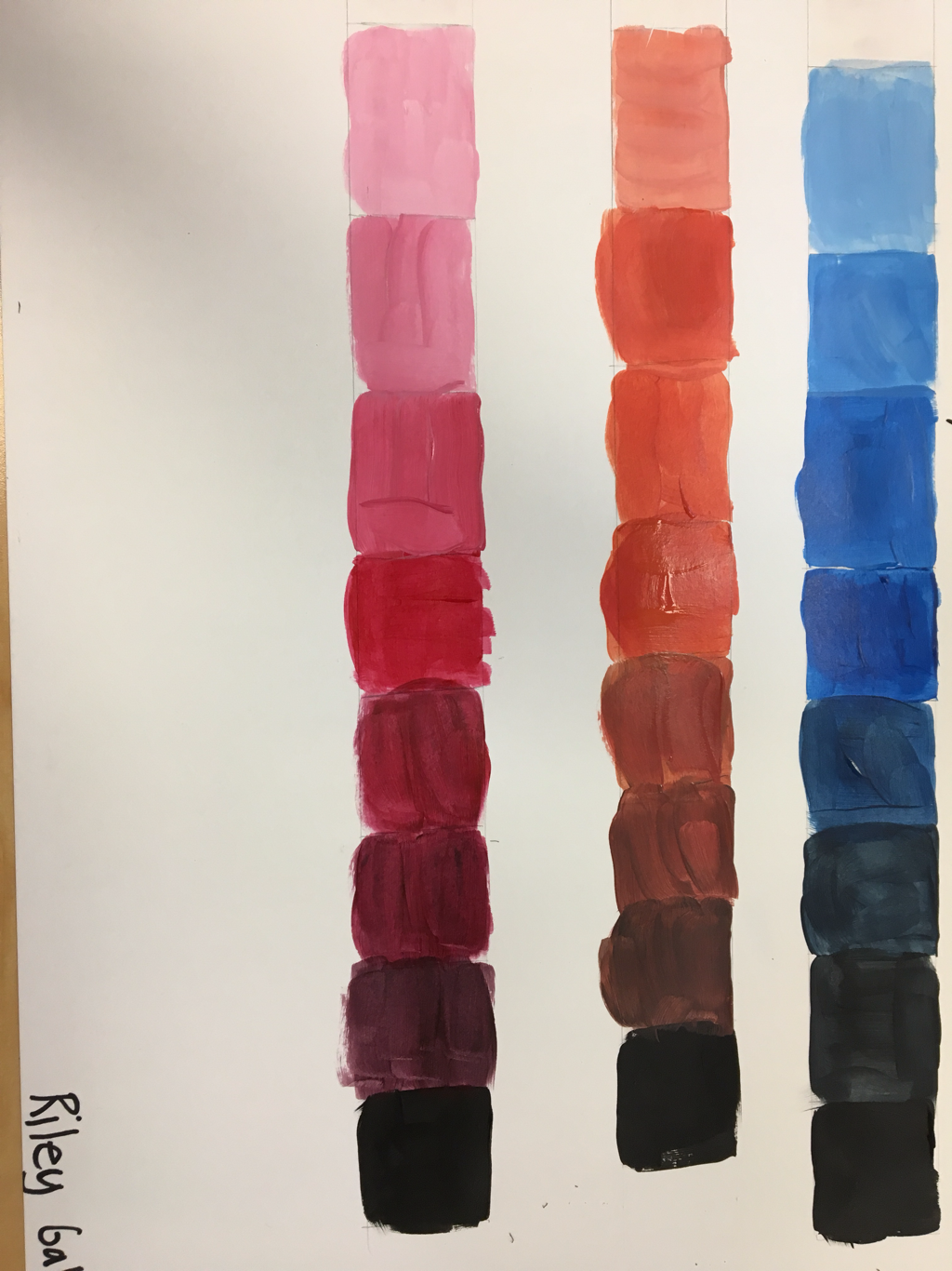
Paint value chart
We learned how to deepen and lighten a color
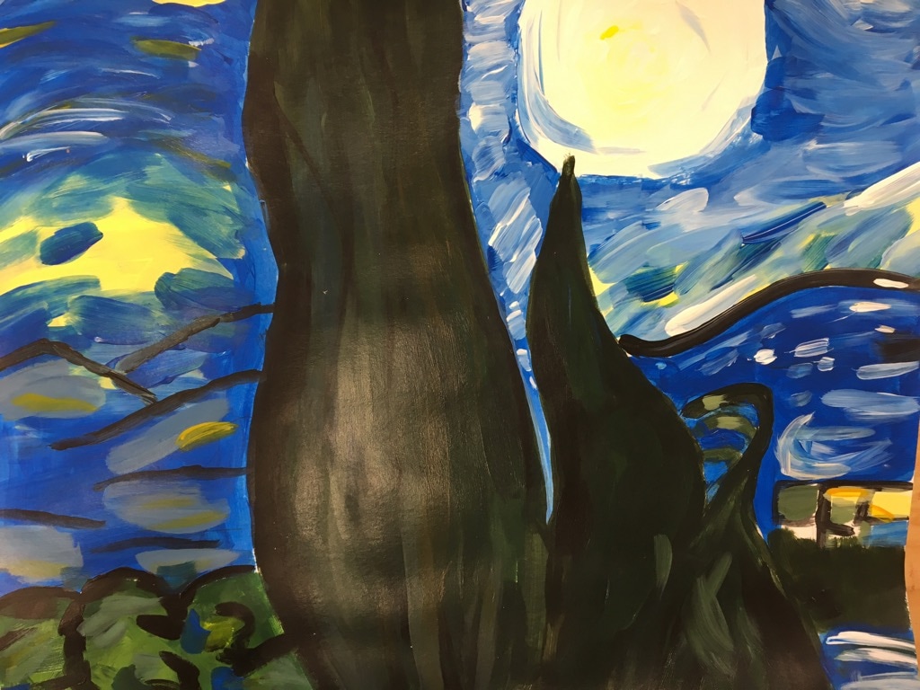
Recreation of painting
we each got a piece of a famous painting and recreated it.
color wheel
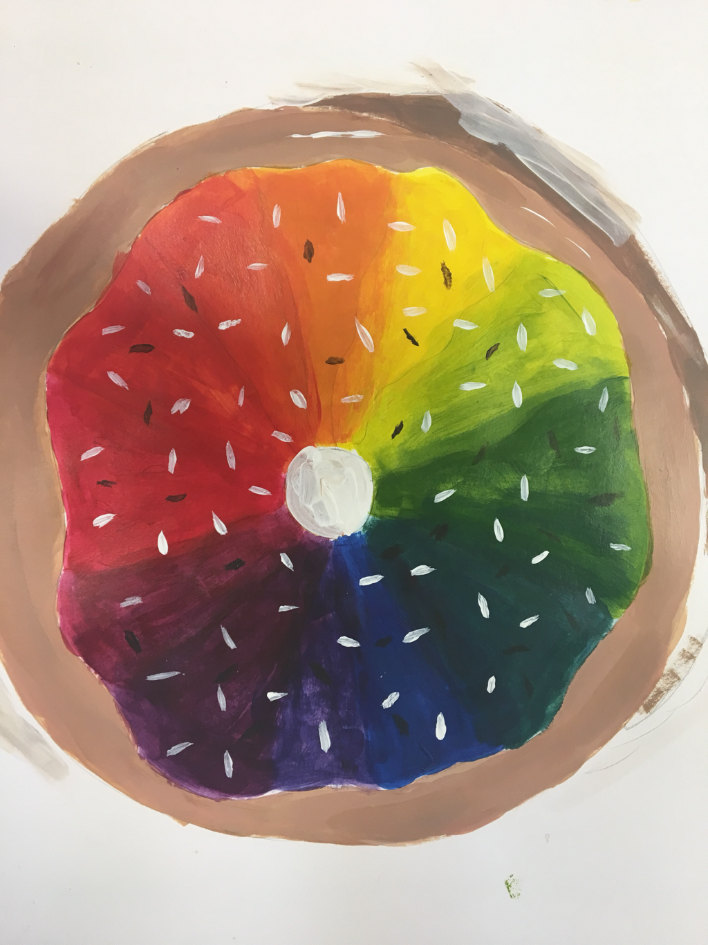
i made a donut color wheel
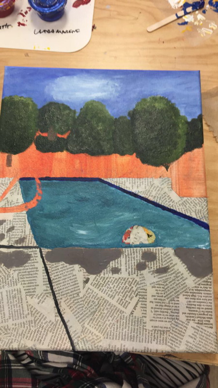
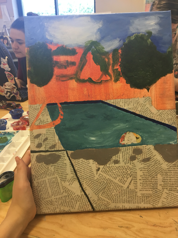
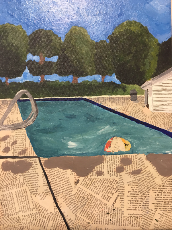
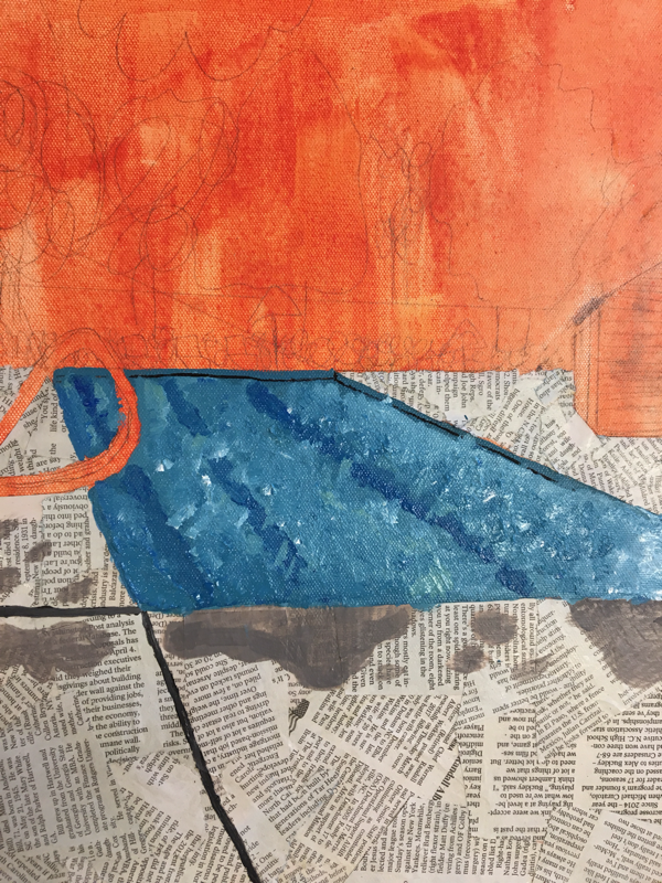
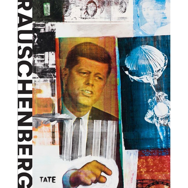
Painting in the style of a famous artist-- Robert Rauschenberg
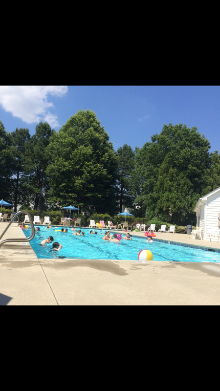
inprogress pictures and reference photo
Self Evaluation
For this piece we had to have an inspired artist, and mine was Robert Rauschenberg. He used mixed medias, repeating elements, bright colors and abstract paints. I decided to paint my neighborhood pool but switch it up and use mix medias. My painting is pretty neat for the most part, some of my edges of rough but overall it looks pretty good. The most difficult part of my piece was adding shadow and dimension to the railing. Also the building was tough because it did not know how to add proper shadow. Since we were supposed to base our paintings off of an artists, i used bright colors because Rauschenberg used sporadic pops of colors and also the newspaper on the ground. My artists didn't really paint landscapes but if he saw my painting i think he would enjoy it but not see how it is based off of him. If i could redo this painting i would make it more into a collage than a painting to represent the artists style.
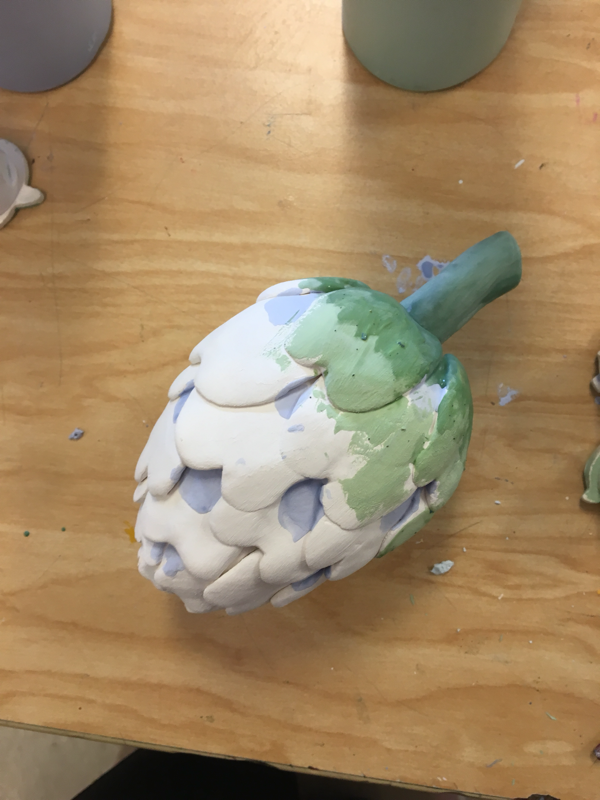
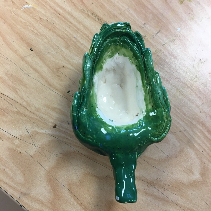
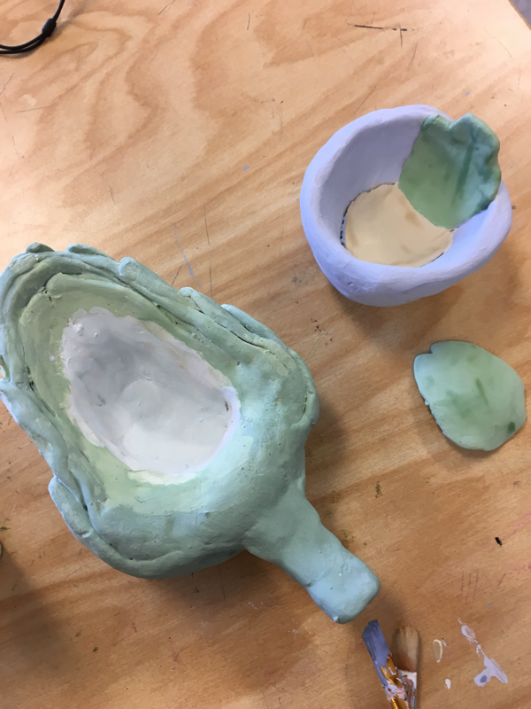
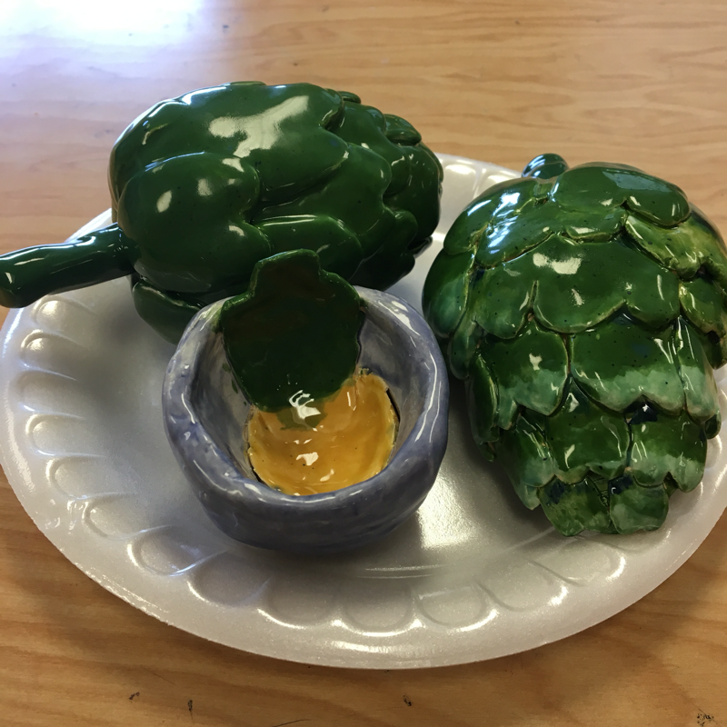
Food Clay sculpture
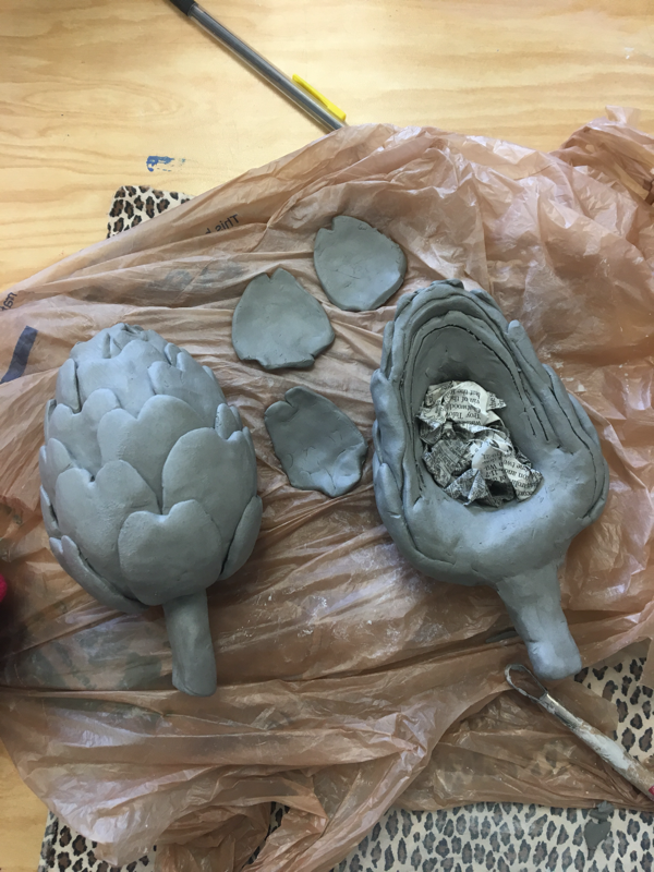
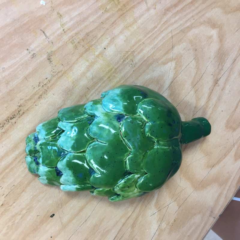
For my food clay sculpture I made an artichoke. My clay itself is very neat and was very well made but once i added the glaze on top it became ugly. The most difficult part of this project was deciding how to paint it. It was hard because i didn't know what color to use and how to layer it. The colors worked well together but did not blend how i wanted it to. I think my sculpture is interesting from all angles. The whole artichoke can be moved to any angle and it still looks good. The half artichoke can be used as a bowl which i think is very cool. The difference between constructing a sculpture and doing something 2D is that you need to plan more out and do sketches at multiple angles. To make textures in your sculpture i added leaf layers. My added leaves make my artichoke look very real. If i were to do this project again i would make the paint look better by only using two or three colors and no light colors. Overall i think my food sculpture turned out very well!
